
Hannah Shearman Photography Rebrand
Relaxed | Nature-inspired | Storytelling | Rebrand
Hannah Shearman is a wedding, family, and brand photographer with a deep love for nature and storytelling. She wanted a rebrand that felt relaxed, outdoorsy, and truly her. We created a new visual identity inspired by her memories, her work, and her love of wild places, complete with earthy tones, hand-drawn details, and her signature ladybird symbol.
The Client Brief
Working with Hannah on her rebrand was such a joy. A wedding and family photographer and filmmaker, Hannah captures real moments and genuine connection with a relaxed, outdoorsy energy that shines through in her work. She’d been using her original logo since launching her business four years ago, but it no longer felt like “her”. It was time for something more intentional, branding that better reflected her style, values, and story.
From the start, it was clear Hannah wanted her new branding to feel grounded and natural, with just the right mix of sentiment and simplicity. We started with a brand discovery session to get to the heart of her business, how she works, what inspires her, and what makes her different.
Hannah needed a rebrand that:
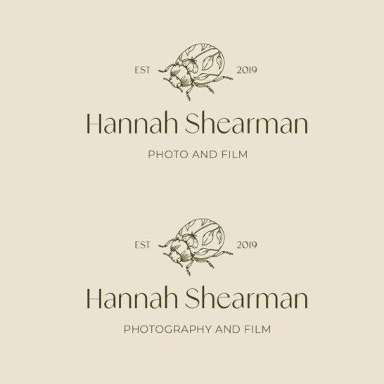
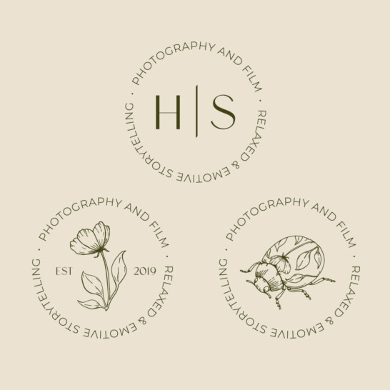
- Updated her logo to feel fresh but kept the ladybird she’s always loved
- Offered variations on her logo with different straplines for photography, film, or both
- Reflected her love for the outdoors and nature
- Included fine line nature illustrations to tell her story and use across her website and social media
- Featured a soft, natural colour palette taken from her own photos
- Felt personal, relaxed, and authentic—just like her
The Brand Vision
Hannah wanted a brand that felt:
- Relaxed and down-to-earth
- Connected to nature and adventure
- Emotive and storytelling, and focused
- Like her personality, fun, genuine, and creative
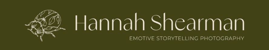
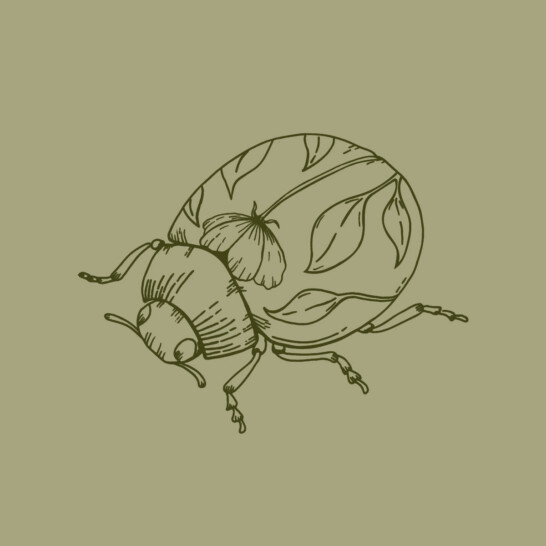
Hannah kept her original business name but wanted to give her visual identity a completely fresh feel, weaving in new strapline variations to reflect both photography and film. It was important to Hannah that we kept the ladybird in some form, something she’d included since day one. More than just a motif, the ladybird was personal: a symbol of good fortune, love, and new beginnings, and a nostalgic nod to her childhood memories of playing outdoors.
“I want my branding to be as me as possible so people can tell who I am and what I love at a glance.”
The Design Approach
We started with a deep chat about Hannah’s values and style, then:
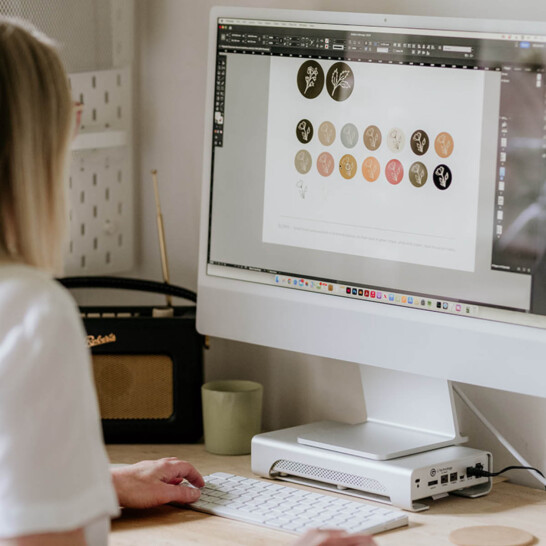
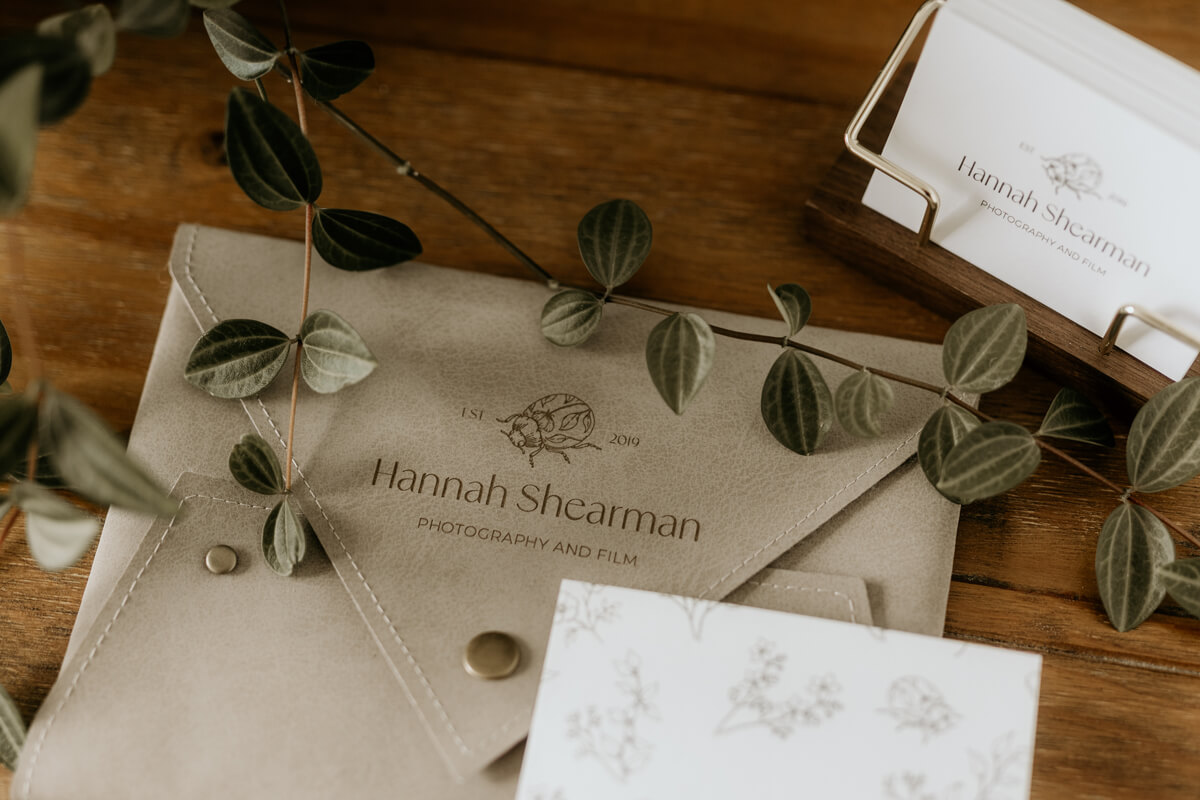
- Refined her ladybird logo to feel fresh and elegant, with variations for her photography and film services
- Pulled a colour palette of earthy, natural tones from her photography — soft greens, warm neutrals, and muted shades
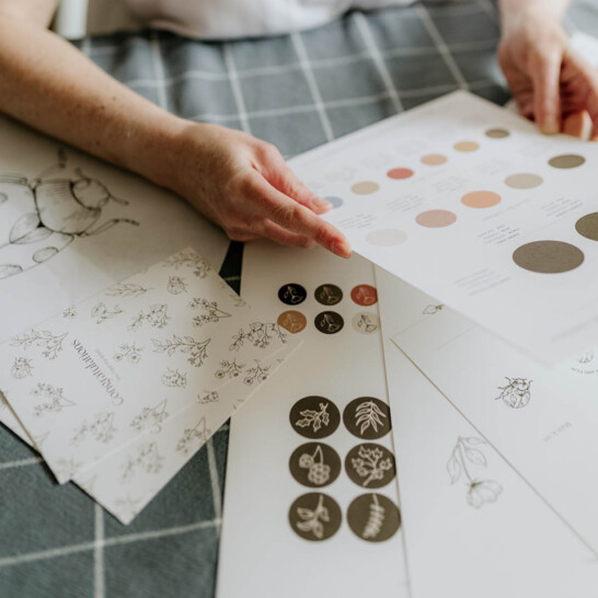
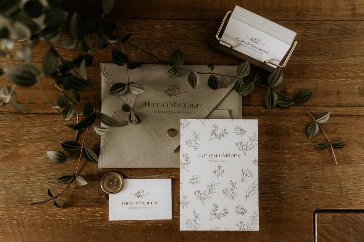
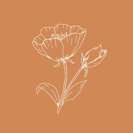
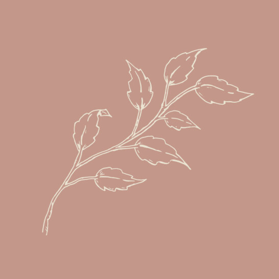
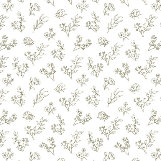
- Created delicate, hand-drawn nature illustrations of leaves, ladybirds, and flowers to bring her story to life
- Designed Instagram highlight icons in a gentle, natural style to tie everything together
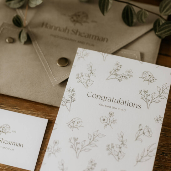
- Developed a subtle pattern from the illustrations for thank-you cards and other print materials
The soft, nature-inspired drawings echo the tone of her work and reflect her deep connection to the outdoors, whether she’s hiking in her spare time or encouraging couples to embrace the wild weather on their wedding day. A clean sans-serif font was chosen with small, delicate accents of detail, reflecting how Hannah’s photography style always captures those hidden, quiet moments.
One of my favourite additions was the bespoke brand pattern I created using her illustrations, a subtle, beautiful backdrop she now uses on thank-you cards and packaging, bringing a truly personal touch to client communications.
The Final Brand
At its core, this rebrand was about creating something that felt true to Hannah, not just the work she does, but how she does it: with care, ease and a genuine love for her couples and their stories.
“I’d like to think I make their whole experience more relaxed and fun, while also creating lovely memories together.”
The finished brand is a perfect fit for Hannah’s relaxed, outdoor-loving style. The ladybird stays front and centre, surrounded by gentle line art that feels personal and unique. The colour palette complements her photos beautifully, creating a calm and natural vibe across her website, socials, and printed materials.
That’s exactly the feeling we wanted to echo in every visual detail. Her final branding reflects a photographer who is both creative and grounded, with a natural storytelling style and a warmth that puts people instantly at ease. With logo variations, give her flexibility to highlight her different services, and the pattern and icons add warmth and personality throughout her brand touchpoints.
![]()
![]()
The Results
Hannah is delighted with her fresh new brand. She felt involved in every step and loved how the branding reflects her personality and values. The new look is already helping her connect with couples who love nature and adventure as much as she does.
“Simone is the best! Simone kept in constant contact with me throughout the design process to make sure what she was creating resonated with me, sent me proofs of designs and kept me involved in the whole process. I honestly couldn't be happier with my logo, illustrations, icons and colour palette that she has created for me. Simone created branding that perfectly represents my business and style. I absolutely love it and couldn't wait to share it everywhere!”